User Interface
The User Interface for Beasts of Bermuda has recently gone through a change, as I write this on 8/9/2017.
Current UI
In August, 2017, Beasts of Bermuda underwent a UI revamp. The older, legacy UI was replaced with one that was more intuitive to players less familiar with the game. The new UI contains five elements to represent six resources, Health and Comfort both being represented on the same UI element.
- Health is represented by a silhouette of the current creature the player is playing, much like Primal Carnage's representation of Health. It rests in the bottom-right corner.
- Ability is represented by an orange icon that changes depending on which creature the player is playing. It typically takes the shape of whatever that particular creature uses to attack with, often being a jaw or claw silhouette.
- Stamina is represented by a yellow icon that changes depending on which creature the player is playing. It typically takes the shape of whatever the particular creature uses for locomotion, often being a foot, flipper, or wing.
- Thirst is represented by a simple set of water droplets. In the case of aquatic creatures of whom use [[Air
air]] instead of thirst, the icon changes to a set of bubbles.
- Food is represented by one of three icons currently, based on diet. Piscivores have a fish icon. Herbivores have some leaves. Carnivores show a piece of meat.
- Comfort is represented by the color of the health icon; the silhouette of the creature they are playing. It changes color based on comfort, spanning reds, oranges, yellows, greens, and blues.
Legacy UI
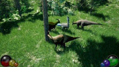
Prior to this date, the UI for Beasts of Bermuda consisted of six colored spheres, representing six resources a player must manage in-game. The spheres were the first pass at a HUD for Beasts of Bermuda, and tremendous inspiration from Diablo II's interface was taken in the creation of this interface. Due to near unanimous unpopularity for the UI among the community, the lead developer, Predatoria, begrudgingly accepted defeat and allowed his beloved Diablo II UI to be reworked.
The legacy UI had six elements.
- Health was represented by a large, red globe on the bottom-left side
- Ability was represented by a medium-sized, orange globe on the bottom-left side
- Stamina was represented by a small, yellow globe on the bottom-left side
- Thirst was represented by a small, blue globe on the bottom-right side
- Food was represented by a medium-sized, purple globe on the bottom-right side
- Comfort was represented by a large, green globe on the bottom-right side

