User Interface
The Skin Customization UI can be found here.
The Scoreboard UI can be found here.
The Chatbox UI can be found here.
The HUD UI can be hidden or shown with the use of a keybind. By default, it is K.
Current UI
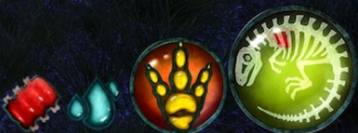
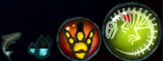
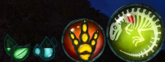
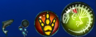
In August, 2017, Beasts of Bermuda underwent a UI revamp. The older legacy UI was replaced with one that was more intuitive to players less familiar with the game. The new UI contains five elements to represent six resources, Health and Comfort both being represented on the same UI element.
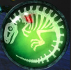
- Health is represented by a dinosaur skeleton; the highlighted portion goes down according to how much you have and comfort is also shown on here.
- Ability is represented by an orange circle. It is depleted when using 'special' attacks or carrying someone.
- Stamina is represented by a yellow 'foot' icon. What percentage of the foot is in yellow indicates the amount of stamina you have; this is not necessarily out of 100, as talents and the unique specifications of each creature determine the maximum stamina. A rule of thumb on many creatures is that if the 'lower third' of the foot is highlighted, you can perform your special ability. This is not always true, but frequently is.
- Thirst is represented by a simple set of water droplets. In the case of aquatic creatures which use [[Air
air]] instead of thirst, the icon changes to a set of bubbles.
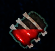
- Food is represented by one of three icons currently, based on diet. Piscivores have a fish icon. Herbivores have some leaves. Carnivores show a piece of meat. Lurdusaurus has a unique kelp icon.
- Comfort is represented by the color of the health icon. It changes color based on comfort, spanning reds, oranges, yellows, greens, and blues. A deep, almost indigo blue is the best possible; an intense crimson is the worst.
By pressing 'O', a player can view their character screen. This indicates precise numbers for all statistics, and allows them to change their skin if they are below 0.7-in addition, they can check their gender.
Legacy UI
Prior to this date, the UI for Beasts of Bermuda consisted of six colored spheres, representing six resources a player must manage in-game. The spheres were the first pass at a HUD for Beasts of Bermuda, and tremendous inspiration from Diablo II's interface was taken in the creation of this interface. Due to near unanimous unpopularity for the UI among the community, the lead developer, Predatoria, begrudgingly accepted defeat and allowed his beloved Diablo II UI to be reworked.
The legacy UI had six elements.
- Health was represented by a large, red globe on the bottom-left side
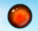
- Ability was represented by a medium-sized, orange globe on the bottom-left side
- Stamina was represented by a small, yellow globe on the bottom-left side
- Thirst was represented by a small, blue globe on the bottom-right side
- Food was represented by a medium-sized, purple globe on the bottom-right side
- Comfort was represented by a large, green globe on the bottom-right side
Other UI Elements
In addition to the display of primary resources, there are some other elements of the Beasts of Bermuda UI as well.
The UI contains a breath meter. This meter only displays when a non-aquatic creature goes underwater. It is straightforwards and simple. It is identical in both the current and the legacy UI.
